Distinguishing user requests from user needs — Beam.gg Product Design
A study behind Beam.gg’s product design and prototype — for its defining feature see Gamification Strategy and also Website and Brand Identity.
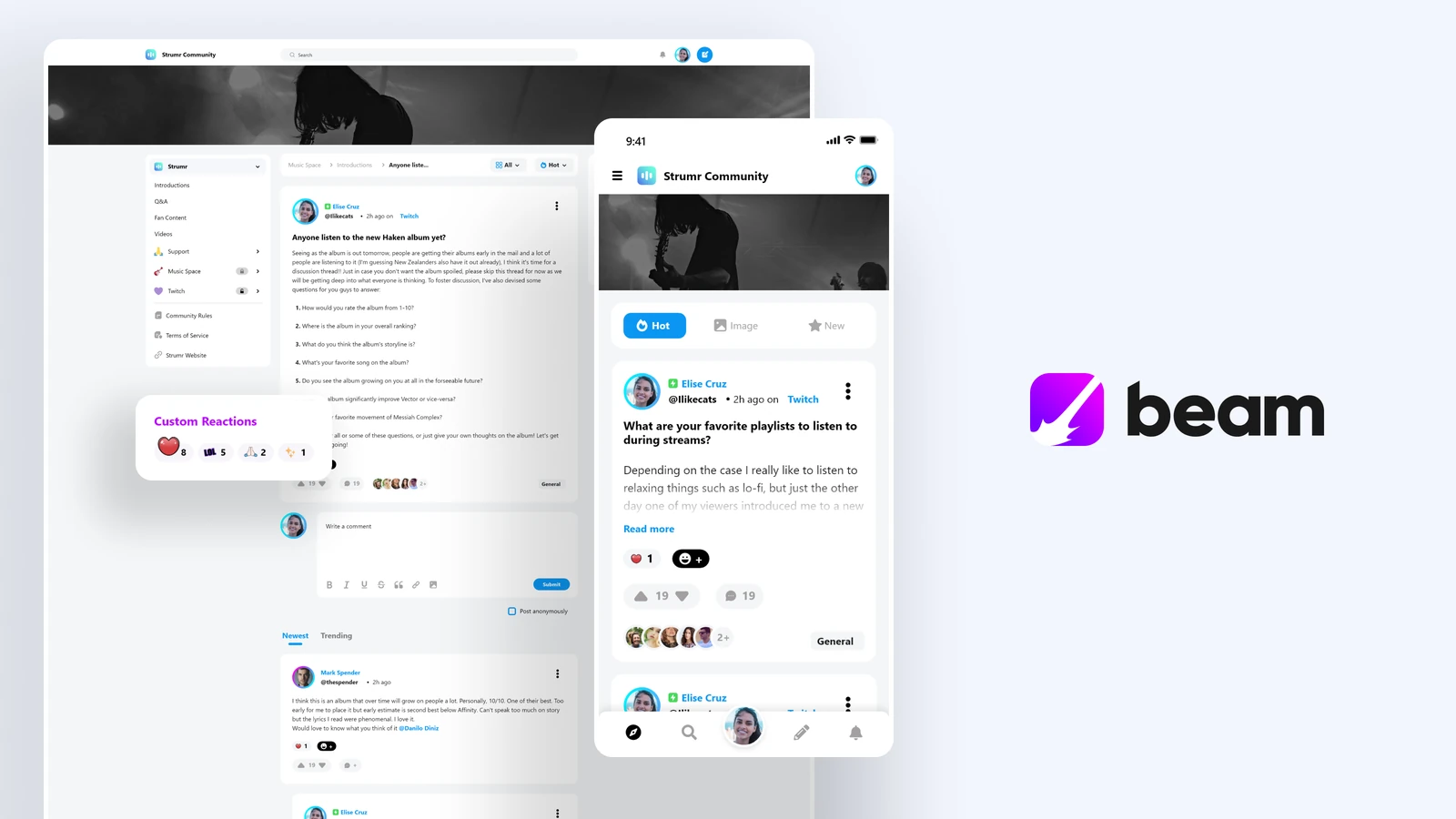
We made a box but the customers needed pallets.
That was one challenge our small team of less than five faced in 2020–2022 when designing Beam.gg, a forum-based B2B2C community platform. As the sole designer, I handled everything from wireframing to prototyping, designing in parallel for mobile and desktop. Customers kept asking for more feeds when what they actually needed was better structure, which led to a more scalable product.
The initial structure was built around a single main feed with post-type categorization, giving users a straightforward and familiar navigation. The challenge wasn’t just expanding the scope of what we planned, but doing it without breaking what was already built.
One feed wasn’t enough, and our solution landed sideways.
When the 2020 pandemic forced people to stay home, demand for online groups exploded. The existing platforms like Reddit, Facebook, and general social media had the same flaw: the creator did not own their community. Beam.gg was built around this idea in a B2B2C format, giving businesses ownership and control over their platform.
As the product took shape and we did a soft launch, the most common feedback we received from the first customers was clear: they wanted more than just one feed for their community. We had already implemented post categories and hashtags, so we thought multiple forums would be redundant and unnecessary. However, with this much feedback around it, we haphazardly implemented Subforums as the very first user-requested feature.
Given the rushed approach to deliver the request, the implementation — especially UX-wise — was not good. We solved the problem of offering more than one forum for the communities, but without good discoverability and general ease of use, having more than one forum was in some ways a negative thing, as entire posts and topics of discussion could be hidden away from an unaware user.
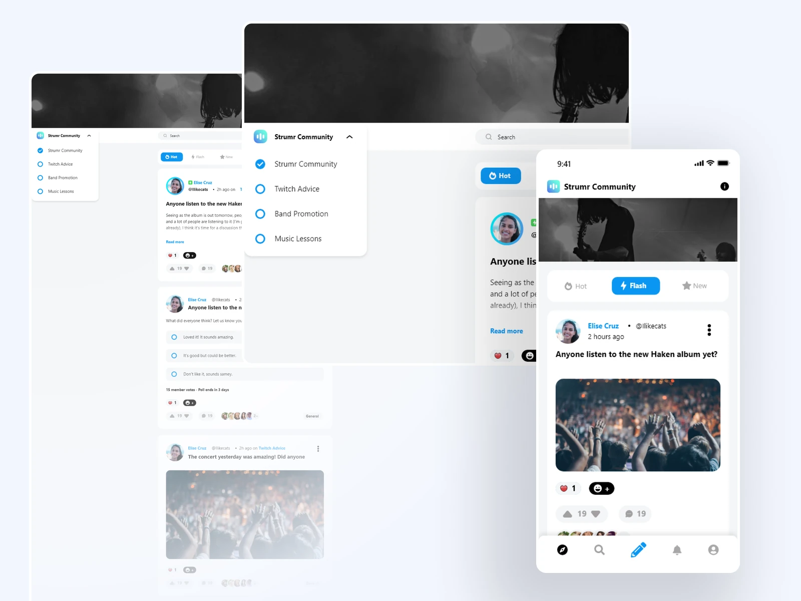
Visibility was bad, but structure was the problem in disguise.
With the customers getting what they asked for but in a less than ideal way, the feedback we kept getting through direct channels showed we needed to address the feature in a more fleshed out, proper way.
It became clear that, although they were asking for more instances of the feed, what they actually needed was better categorization and separation within the community. Putting the Subforums on display in the UI would have worked fine, but it wouldn’t have solved the issue for good.
At the expense of keeping the existing problem live for longer, I decided to plan ahead and work on the fix in a major way. Instead of simply giving more visibility for the Subforums in the UI, I gathered all the pieces of what it meant for users to submit and interact with a post and brought them back to the drawing board.
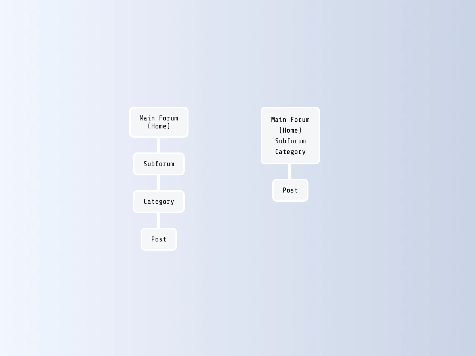
Fixing the structure brought in a much-needed polish.
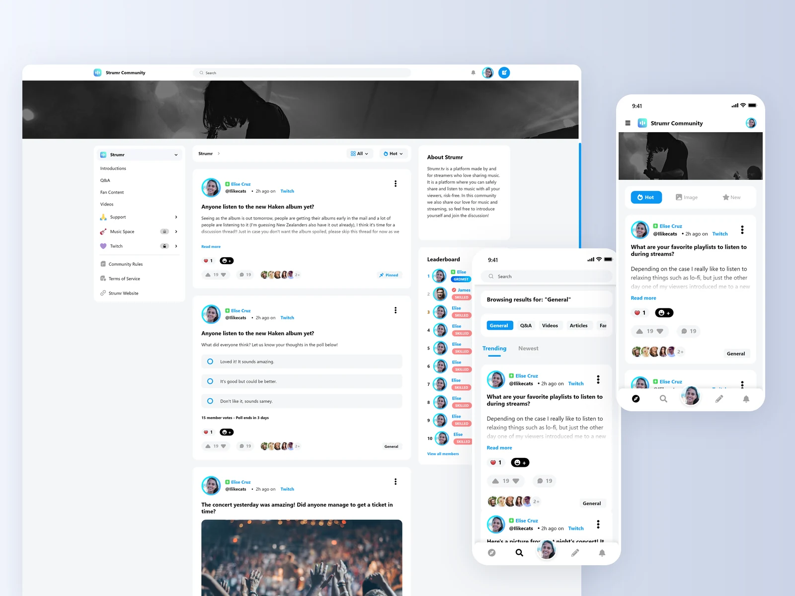
The final implementation took form with various systems in place. Not only did Subforums have a clear place in the UI, but we also merged post categories into the forum hierarchy, giving community owners even more control and flexibility over the community organization.
Visually, the community feed was now much more readable and accessible. Everything had its place and was visually distinct in a way that all the introduced features could be understood by the users. The wider feed gave posts more breathing room, the “Read more” accommodated more posts in busier feeds, and the improved comment section and general feed types made it easier to sort through what users wanted to see first. All of this was fully customizable by the community owners.
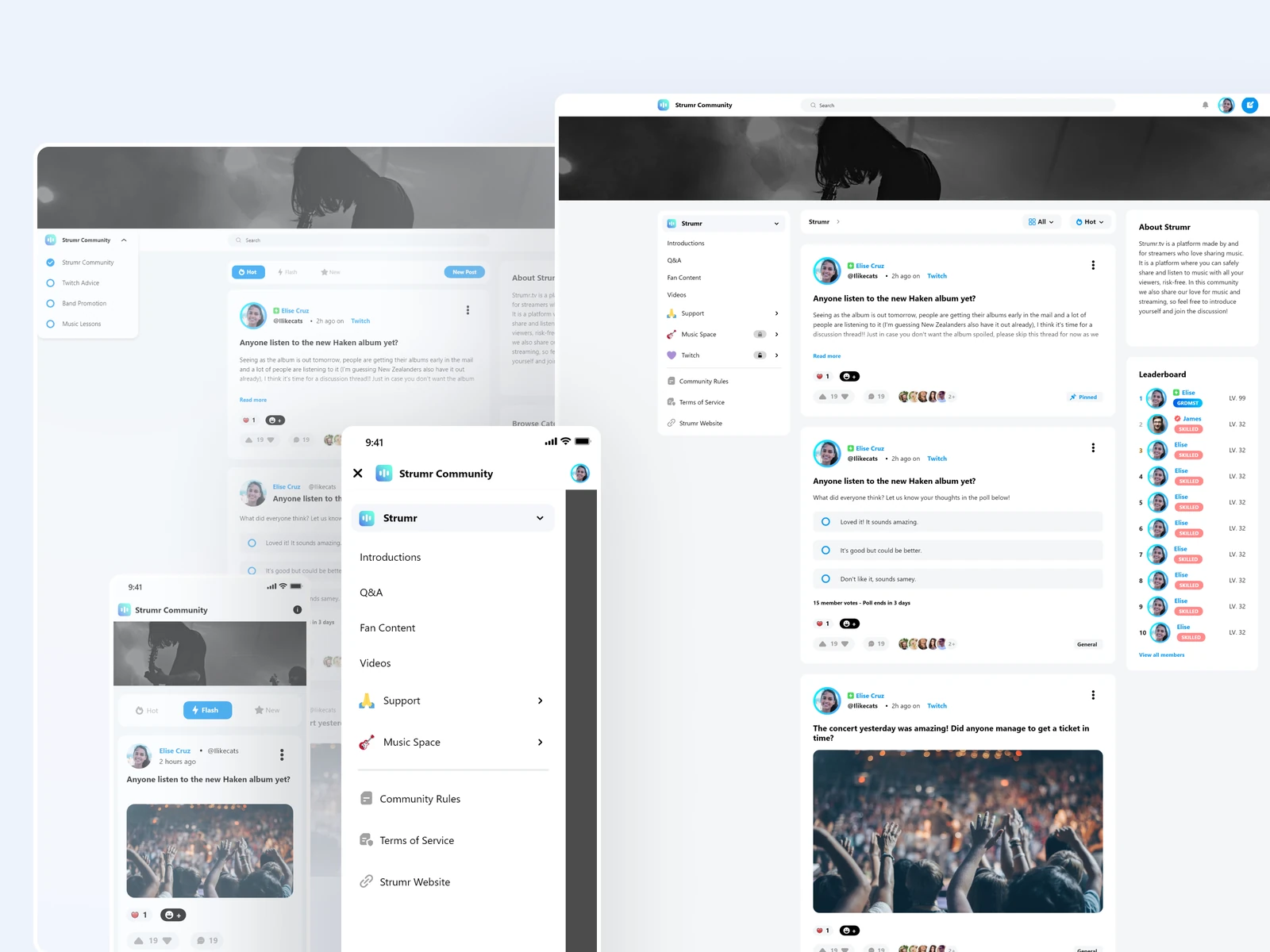
Designing for Community Owners and Members simultaneously was also a challenge.
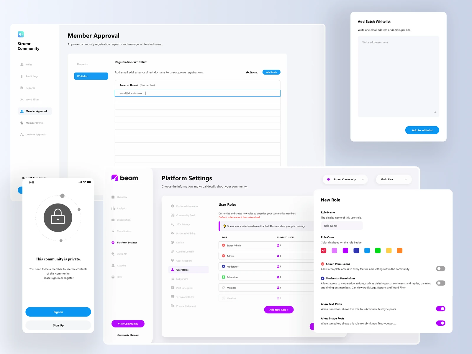
Another upgrade we made was the introduction of Discord-like user roles, which also solved another common user request of making communities private, giving businesses real control over who sees what. On this one, leadership decided on a manual one-by-one approval system which would require admin work to accept members into the communities. I pushed for facilitating the experience by adding a Whitelist feature, which was highly praised by community owners as it made it simple to invite and pre-approve members by adding their email addresses or email domains into the list.
Creating the navigation for this meant that we needed to give owners deep-level control over the permissions, and also make it so users could tell at a glance how and what these permissions changed in their experience. Small details went a long way in solving that, such as adding username badges for Admins and Moderators, and adding locked visuals to inaccessible areas on the community for users without viewing permissions.
Desktop and Mobile experiences needed to go hand in hand.
As a solo designer on the project, managing the scope and maintaining consistency was one of the most difficult things. Initially, the design philosophy was “Mobile first,” but as the product evolved it became clear both mobile and desktop had to be put on the same level to keep things coherent.
One of the things we did was keep the navigation always visible no matter where you were on the platform. On desktop, that meant keeping the left navigation of forums and categories always on screen, as well as a button to submit new posts next to the profile icon. For mobile, the left-hand hamburger menu did the job of keeping forums always there, and the bottom navigation now had a bigger emphasis on the user profile, but always having the “new post” button right next to it.
In general, these changes made it so the member experience for both mobile and desktop didn’t have compromises. The limitations we had were more owner-sided, as translating things such as analytics graphs and general Dashboard settings was more time- and resource-consuming than the project allowed at the time.
A final update brought in sleek visuals and improved navigation for everyone.
Despite taking a long time to ship as it had so many different moving parts, this update felt to me and the team like our product was elevated to a higher standard. The active users at the time really enjoyed the new forms of customization that they could now access in their communities, and we also got comments about how it was now easier to navigate in the new UI.
In hindsight, this update unfortunately couldn’t fix the biggest problem we had in our platform, which was the lack of users that would help us push the product even further. Another thing that would’ve made this update even better would be polishing the browsing experience with micro-interactions across the whole platform, but due to budget and time constraints this was pushed to the back burner.
Moving on from this project, I learned that no matter how much you plan ahead, users might end up asking for something different than you had prepared for. For my next projects, I’d love to be able to tackle such problems with a broader team of designers and collaborate to find the solutions that make sense and can be implemented realistically.
Also read the other Beam.gg studies, Gamification Strategy and Website and Brand Identity.