Refreshing the brand and building a website that sells — Beam.gg Website and Brand Identity
The one with all the eye candy — see Product Design and Gamification Strategy for the UX part of the project.
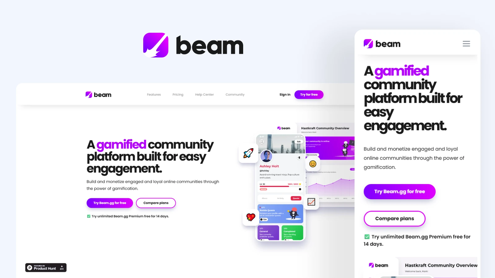
Making a modern-looking and smooth-feeling website that actually sells.
Beam.gg was a gamified online community platform built by a team of less than five from 2020–2022, think Reddit but with customer ownership and tons of customization. I was a solo designer working from research and wireframing to landing-page development and (some) marketing. In this case study we’ll go through the visuals of this project, brand refresh, and how we made a sleek site that looks and feels great.
Social proof carries some weight, but it can’t carry the page on its own.
When designing the website for Beam.gg, I already knew roughly what makes a good landing page, but it would require a lot of research and several feedback sessions to make it great. Although the initial wireframes and versions of the website were lost to time, we knew from the beginning that we needed to sell the product right away, given our strong competition and the later confirmation that gamification was the right path forward (as touched on in the other studies).
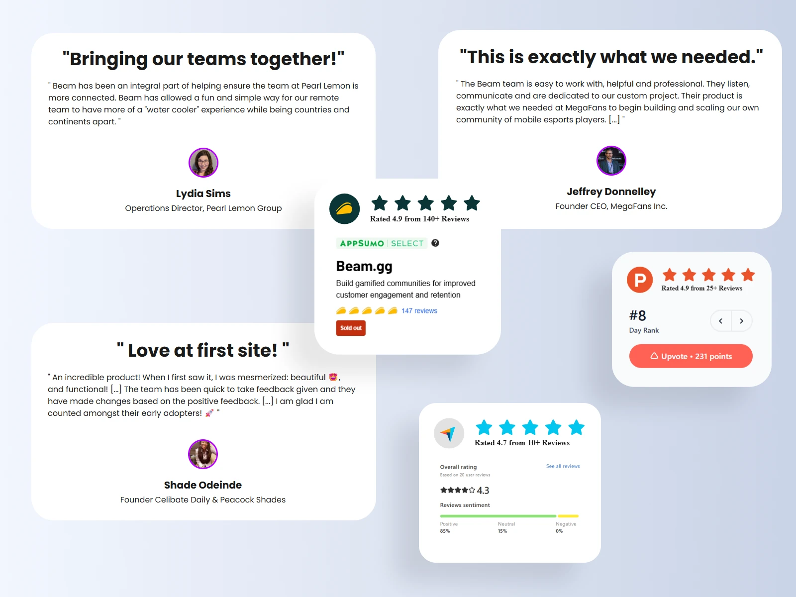
Having strong scores on Product Hunt and AppSumo was good social proof, but we still needed to display the product nicely and set the tone of the experience right away.
Bright colors with smooth gradients, high contrast, smooth edges, soft shadows, colorful icons and butter-smooth animations. All of those put together ended up creating a website that both looked and felt nice to browse. It did take a lot of effort to get to that point, though.
Showing your product on the Hero is tricky when every screen is important.
After many iterations of testing and adjusting, the Hero Section had a good tagline that proved to pique people’s interest (that’s the A/B test from the Gamification Strategy study). The part that was difficult, however, was choosing and displaying the correct images to pair well with the tagline.
Despite our product being people-focused — being a community platform and all — we wanted to shy away from using stock images since we didn’t, for better or worse, have a target demographic. Showing any specific group of people to sell the idea of “community” could alienate everyone else who wasn’t on display. We didn’t want to do that.
The right move was to use product mockups and screenshots, but that was also not that simple since the product didn’t quite have the one screen that sold the idea of the product. We had to use different parts of the platform to display the things that made it different.
Using an animated GIF (pronounced “gheef”) allowed us to show multiple screens at once and made the hero feel more dynamic at the cost of performance, given the size of the image. We also displayed a static view of the Admin dashboard, to sell the idea of management and owner control, and spruced it all up with colorful emoji icons that reacted to mouse movement. Setting up those icon interactions was a challenge, given how the elements had to be displayed in an Absolute position, but it was done in the end.
Keep function over form, and accommodate other viewports.
The rest of the page followed the principles we talked about before. Bright colors, gradients and smooth animations all around, but one personal concern I had was overusing those aspects. I was making a site to sell a product, not to win a design award. I didn’t want over-the-top parallax transitions or crazy effects that overshadow the content. In hindsight, the full-gradient background on the final call to action section might have been a bit too strong, but a CTA has to be a bit like that so I’ll stand by this excuse. Leaning further on function over form was the Blog, made from simple pages using Webflow’s CMS.
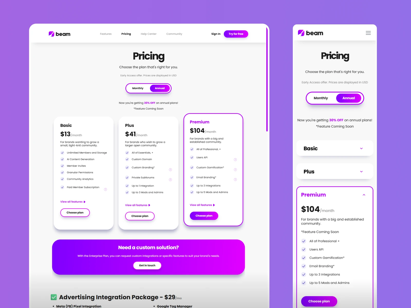
Another challenge and big focus was for mobile to have, as much as possible, the same level of smoothness as the desktop view. This is of course not as easy to achieve, since mobile not only has the obvious screen differences, but also other variables and fewer ways of interacting with the page compared to desktop. Because of that, we had a few sections that weren’t working well, such as the plan comparison chart on the Pricing page, and the feature display box on the Features page. It took me some time to realize, but it was a big step forward for the project — and for myself as a designer — to understand some sections are better off just being remade entirely for different viewports. It makes maintenance and editing a bit more difficult, but the overall quality of the delivery becomes much higher.
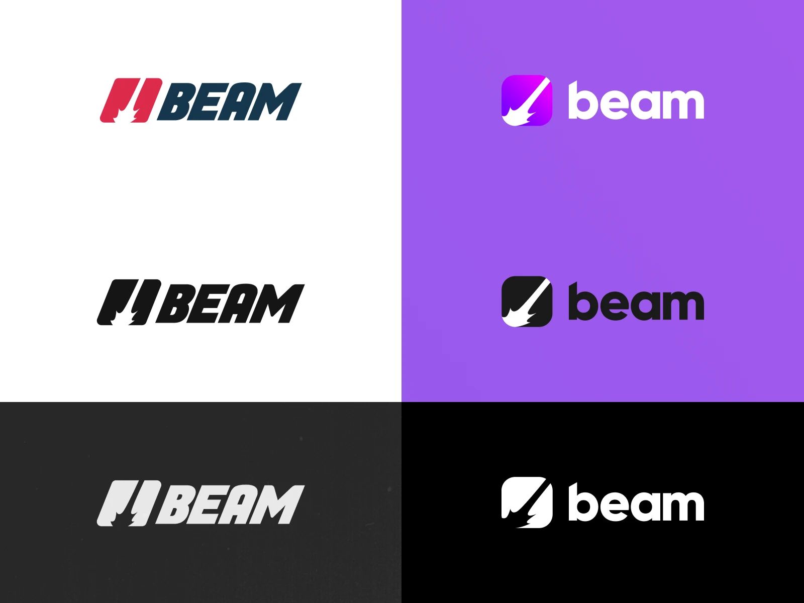
Revamping the logo made the brand identity fall naturally into place.
The logo for Beam.gg was already done by a different designer when I started working on the project. After using the logo as-is for some time, the muted colors and overall look didn’t feel quite right to me. I ended up working on a refresh of the existing logo and setting up an overall visual identity of the brand. Choosing bright colors with trendy gradients gave that sleek, eye-catching look to it, and going with pink/purple as the brand colors helped achieve an industry-agnostic look, as basic colors such as blue, red and green tend to refer to specific types of businesses.
Choosing the typography was also an important aspect in keeping the brand modern-looking. Poppins makes for a fantastic heading and button font, and pairing it with a sharper sans-serif font makes for a simple but smooth combination.
When it comes to applying this visual language across the website and product, it was important for all of it to be part of a system. At the time I wasn’t seasoned enough to have cooked an entire design system from the beginning, but I understood that having collections/elements/styles would make designing and implementing faster and more accurate.
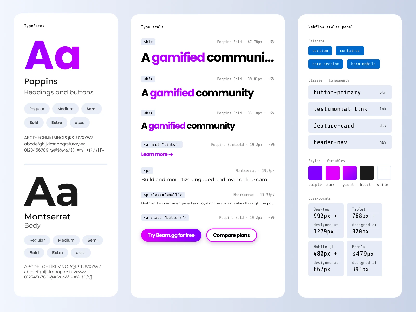
Put it all together and you get a website that catches the eye of users and peers alike.
It wasn’t from one day to the next, but the outcome of the website was a strong look and overall smooth browsing experience that showed improved traffic and decreased drop-off. Things like on-scroll/hover animations and other details like a custom scroll-bar really gave the website that premium feel.
I wasn’t often filled in when it came to the investors’ side of the project, but I heard no complaints about the visuals of the product, website and/or presentations that were shown to them, which for me is already a win.
Peers from similarly sized businesses would often praise our website and product’s visuals, which actually led to me taking charge of a redesign and implementation of the website for a partner company (see Feminuity for how the site turned out). This side-project meant taking time away from Beam.gg, which wasn’t ideal at the time, but it was also a breath of fresh air and it helped me build back momentum when coming back to the usual work.
There’s always room for improvement, and it all just makes the next project better.
Overall, this website turned out stronger than I first imagined it in my head. Now, with more experience, I can see many things I would’ve done differently. Lottie animations instead of GIFs, better under-the-hood organization, deeper A/B testing and SEO optimizations… But with the time and resources available during the project, I am proud and satisfied with the outcome.
Working on this series of case studies has put many things in perspective and has shown me how far I’ve come as a designer, as well as how much further I can continue to grow and learn. Regardless of the challenges future projects will bring, I’m excited to tackle them and continue to sharpen my craft.
Also read the other Beam.gg studies, Product Design and Gamification Strategy.